Here you will be informed about Future of the Android with Cortana Interface
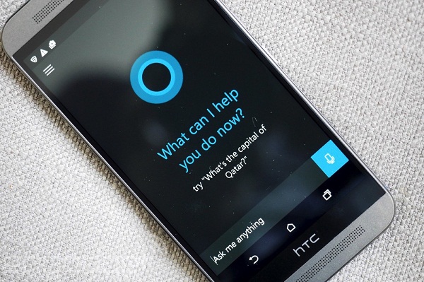
The latest release for Cortana on Android 2.0 would include an unanticipated revamp for the virtual assistant.
The redesigning however, is yet to be finished by Microsoft. With the new version, a brand new screen would open up once you tap its “circle icon” located at the upper right side. This will then reveal a set of choices for ways of customizing.
Future of the Android with Cortana Interface
It’s not yet sure as so what Microsoft would be doing. There may be a colour palette visual at the back, which may imply that Cortana users could change its colour set. With this, the tech giant could also be adding more options. This would probably include themes that could range from light to dark.
The release of Microsoft Cortana followed suit after a new mobile design which has not been seen since the Windows 8 release. As part of the new design, users could now see a bar at the bottom which contains a set of in-app actions, instead of the hamburger.
The plain and blad blue and black hues were scrapped in favour of a better-looking purple shade. This would then be giving the app a more playful “feel” to it. Users for Windows 10 would still be able to use the Cortana with ease even though it has its own downsides. This is especially true with the syncing of their Phones and PCs. The said app could be downloaded via the Play Store for Android subscribers, in the UK and the US.
The iOS version of the app, however, is yet to be launched.
Discover more from Applygist Tech News
Subscribe to get the latest posts sent to your email.

